Image
The image component uses the native HTML img element to display images in your application. It supports responsive sizing, aspect ratios, and background images using Tailwind CSS utilities.
Basic example
Embed images using the standard HTML <img> tag and apply Tailwind CSS utility classes for styling.
HTML
<img class="w-full rounded-lg" src="/images/2.avif" alt="Sample image" />Sizes
Control image size using Tailwind CSS width and height utilities.
HTML
<img class="w-76 h-48 rounded-md" src="/images/2.avif" alt="Medium image" />Use the size-* utility to apply equal width and height on an image.
HTML
<img class="size-48 object-cover rounded-md" src="/images/2.avif" alt="Medium image" />Aspect ratio
Use Tailwind’s aspect-* utilities to preserve image proportions.
HTML
<img class="aspect-3/2 object-cover rounded-lg" src="/images/2.avif" alt="3:2 image" />Square aspect ratio
HTML
<img class="max-h-64 aspect-square object-cover rounded-lg" src="/images/2.avif" alt="Square image"/>Object fit
Control how the image fits within its container using object-* utilities.
<!-- object contain -->
<img class="h-40 w-72 object-contain border border-default" src="/images/2.avif" alt="Contain example" />

<!-- object cover -->
<img class="h-40 w-72 object-cover border border-default" src="/images/2.avif" alt="Cover example" />
Image caption
HTML
<figure class="w-76">
  <img class="h-48 w-full object-cover rounded-lg" src="/images/2.avif" alt="Image caption" />
  <figcaption class="mt-2 text-sm text-center">Image caption</figcaption>
</figure>
Image mask
HTML
<div class="relative size-76">
  <div class="absolute inset-0 bg-default/40"></div>
  <img class="size-full object-cover" src="/images/2.avif" alt="Image caption" />
</div>
Colored mask
HTML
<div class="relative w-full h-76">
  <div class="absolute inset-0 bg-primary-light/50"></div>
  <img class="size-full object-cover" src="/images/2.avif" alt="Image caption" />
</div>

<div class="relative w-full h-76">
  <div class="absolute inset-0 bg-secondary-light/50"></div>
  <img class="size-full object-cover" src="/images/2.avif" alt="Image caption" />
</div>

<div class="relative w-full h-76">
  <div class="absolute inset-0 bg-info-light/50"></div>
  <img class="size-full object-cover" src="/images/2.avif" alt="Image caption" />
</div>

<div class="relative w-full h-76">
  <div class="absolute inset-0 bg-success-light/50"></div>
  <img class="size-full object-cover" src="/images/2.avif" alt="Image caption" />
</div>

<div class="relative w-full h-76">
  <div class="absolute inset-0 bg-warning-light/50"></div>
  <img class="size-full object-cover" src="/images/2.avif" alt="Image caption" />
</div>

<div class="relative w-full h-76">
  <div class="absolute inset-0 bg-danger-light/50"></div>
  <img class="size-full object-cover" src="/images/2.avif" alt="Image caption" />
</div>
Gradient mask
HTML
<div class="relative size-76">
  <div class="absolute inset-0 bg-linear-45 from-pink-400 via-green-500 to-sky-500 opacity-50"></div>
  <img class="size-full object-cover" src="/images/2.avif" alt="Image caption" />
</div>
Hover effect
Hello World!
HTML
<div class="relative size-76 overflow-hidden group">
  <div class="absolute inset-0 z-10 flex items-center justify-center bg-default opacity-0 transition duration-300 group-hover:opacity-70">
    <h6 class="uppercase">Hello World!</h6>
  </div>
  <img class="size-full object-cover transition duration-300 ease-in-out group-hover:scale-110" src="/images/2.avif" alt="Image caption" />
</div>
Custom styles
Apply borders, shadows, and other visual styles using Tailwind CSS.
HTML
<img class="p-1 h-64 object-cover bg-default border border-default rounded-md hover:shadow-xl shadow-gray-200 dark:shadow-gray-800 transition duration-300 ease-in-out" src="/images/2.avif" alt="Styled image" />Responsive images
Images automatically scale on different screen sizes using responsive utilities.
HTML
<img class="w-full sm:w-1/2 lg:w-1/3 rounded-lg" src="/images/2.avif" alt="Responsive image" />Accessibility
Always include an alt attribute to describe the image content for screen readers and accessibility tools.
HTML
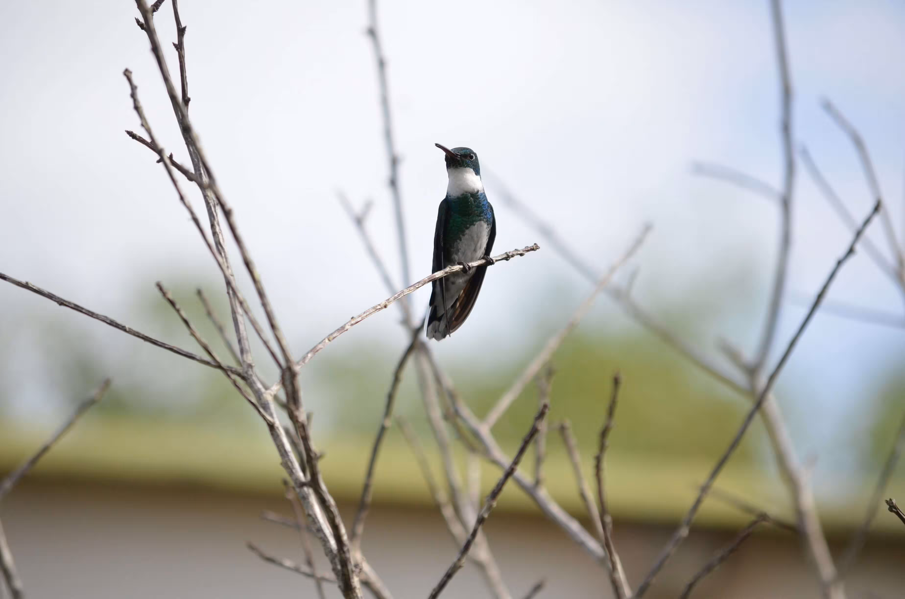
<img class="h-64 object-cover rounded-lg" src="/images/2.avif" alt="A hummingbird sitting on a flower" />