Placeholder
Shows a visual loading state with animated shapes resembling the final content layout, providing a smooth transition while real data is being loaded.
Glow Animation Example
Apply .placeholder for loading indicators and wrap with .placeholder-glow for a glowing effect.
HTML
<div class="placeholder-glow flex flex-col gap-2 w-full max-w-70">
  <span class="placeholder w-full"></span>
  <span class="placeholder size-14 rounded-full"></span>
  <span class="placeholder w-full h-14"></span>
  <span class="placeholder w-full h-14"></span>
</div>
Wave Animation Example
Wrap placeholders with .placeholder-wave to apply a smooth shimmering animation effect.
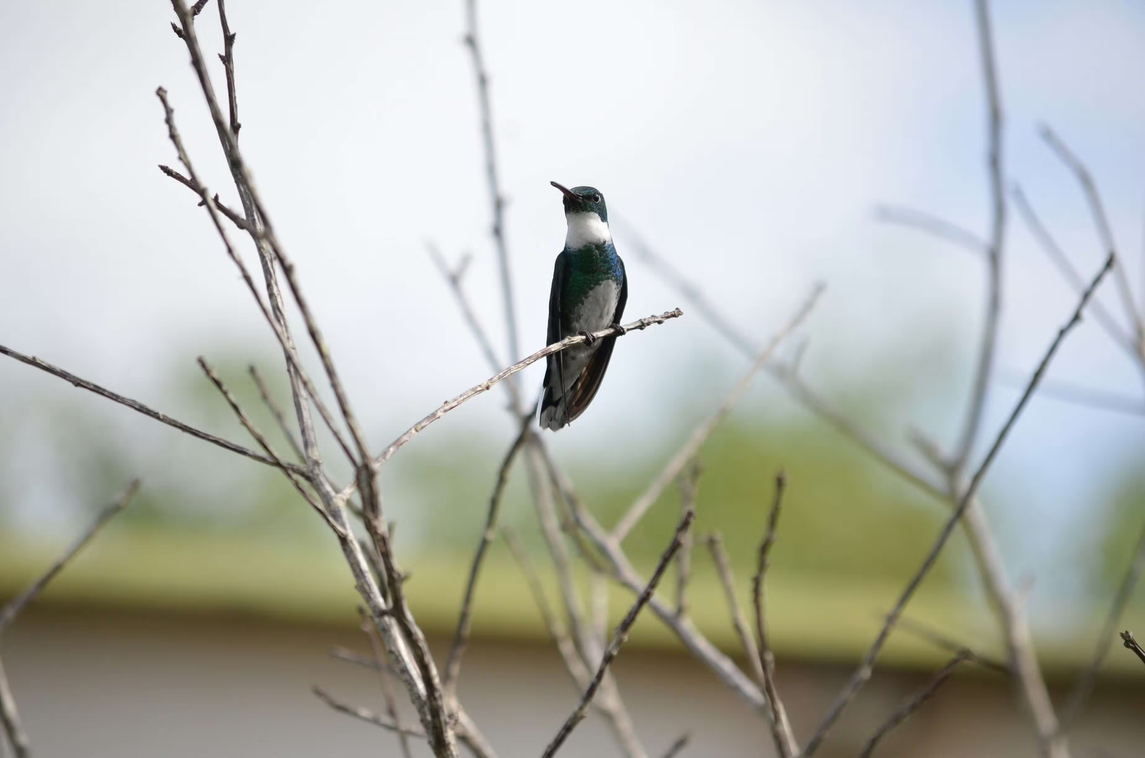
Black-throated Mango male
November 10, 2021

The male Black-throated Mango hummingbird has a metallic bronze-green upper body and flanks, a black throat and chest, and white underparts
HTML
<div class="placeholder-wave card w-full max-w-88">
  <div class="card-header flex items-center border-0">
    <div class="me-4">
      <span class="placeholder size-13 rounded-full"></span>
    </div>
    <div class="flex-1">
      <span class="placeholder w-full"></span>
      <span class="placeholder w-full"></span>
    </div>
  </div>
  <div class="placeholder h-58"></div>
  <div class="card-body">
    <span class="placeholder w-full"></span>
    <span class="placeholder w-3/4"></span>
  </div>
</div>

<div class="card max-w-88">
  <div class="card-header flex items-center border-0">
    <div class="avatar avatar-lg me-4">
      <img src="/images/avatar/avatar_1.webp" alt="Avatar" class="rounded-full"/>
    </div>
    <div>
      <p class="text-default mb-0">Black-throated Mango male</p>
      <p class="mb-0">November 10, 2021</p>
    </div>
    <button class='btn btn-icon ms-auto self-start -mr-2'>
      <svg xmlns="http://www.w3.org/2000/svg" width="18" height="18" viewBox="0 0 16 16"><path fill="currentColor" d="M8 5a1 1 0 1 1 0-2a1 1 0 0 1 0 2m0 4a1 1 0 1 1 0-2a1 1 0 0 1 0 2m-1 3a1 1 0 1 0 2 0a1 1 0 0 0-2 0" stroke-width="0.5" stroke="currentColor"/></svg>
    </button>
  </div>
  <img src="/images/2.avif" alt="Hummingbird" class='card-img' />
  <div class="card-body">
    <p class="text-sm mb-0">The male Black-throated Mango hummingbird has a metallic bronze-green upper body and flanks, a black throat and chest, and white underparts</p>
  </div>
</div>
Width
Control placeholder size by adding width utility classes like .col-*, .w-*, or custom values.
HTML
<span class="placeholder col-6"></span>
<span class="placeholder w-3/4"></span>
<span class="placeholder w-50"></span>
Color
Customize placeholder color using background utility classes like .bg-{color}.
HTML
<span class="placeholder col-12"></span>

<span class="placeholder col-12 bg-primary"></span>
<span class="placeholder col-12 bg-secondary"></span>
<span class="placeholder col-12 bg-success"></span>
<span class="placeholder col-12 bg-danger"></span>
<span class="placeholder col-12 bg-warning"></span>
<span class="placeholder col-12 bg-info"></span>
<span class="placeholder col-12 bg-light"></span>
<span class="placeholder col-12 bg-dark"></span>
Sizing
Adjust placeholder size with modifiers like .placeholder-lg, .placeholder-sm, or .placeholder-xs.
HTML
<span class="placeholder col-12 placeholder-lg"></span>
<span class="placeholder col-12"></span>
<span class="placeholder col-12 placeholder-sm"></span>
<span class="placeholder col-12 placeholder-xs"></span>
Inferring Dimensions
Placeholders automatically match the size of text or elements to infer their dimensions.
h1
h3
paragraph
h1
h3
paragraph
HTML
<div class="flex-3 flex flex-col gap-3">
  <h1 class="placeholder">h1</h1>
  <h3 class="placeholder">h3</h3>
  <p class="placeholder">paragraph</p>
</div>
<div class="flex-2 flex flex-col gap-3">
  <h1>h1</h1>
  <h3>h3</h3>
  <p>paragraph</p>
</div>
Class Overview
A list of all available utility classes for the placeholder component.
| Class Name | Type | Description |
|---|---|---|
| placeholder | Component | Placeholder |
| placeholder-glow | Style | Glow effect |
| placeholder-wave | Style | Wave effect |
| placeholder-lg | Size | Large |
| placeholder-sm | Size | Small |
| placeholder-xs | Size | Extra small |
CSS variables
The placeholder component is built using a set of CSS variables. These variables provide flexibility for customizing styles. See the Theming to customize styles globally and apply overrides as needed.
.placeholder {
  --placeholder-opacity-max: 0.15;
  --placeholder-opacity-min: 0.05;
  --placeholder-bg: currentcolor;
  --placeholder-height: 1em;
}