Card
Cards are a flexible container that group related content and actions together.
Basic card
The basic card component offers a flexible and structured container for displaying content. It comprises a header, body, and footer, facilitating the presentation of information with a clear hierarchy.
- Header: Used for titles or categories.
- Body: Contains the main content, such as text and images.
- Footer: Ideal for actions, like buttons or links.
Basic Card
Card Title
Subtitle
Some quick example text to build on the card title and make up the bulk of the card's content.
HTML
<div class="card max-w-72">
  <div class="card-header">
    <p class='mb-0'>Basic Card</p>
  </div>
  <div class="card-body">
    <h6 class="card-title">Card Title</h6>
    <p class="card-subtitle">Subtitle</p>
    <p class='mb-0'>Some quick example text to build on the card title and make up the bulk of the card's content.</p>
  </div>
  <div class="card-footer">
    <button class='btn btn-sm btn-text-primary'>Learn more</button>
  </div>
</div>
Media
Cards support flexible image placement using utility classes.
Use .card-img-top, .card-img-bottom, .card-img-left, or .card-img-right to place images on any side of the card.
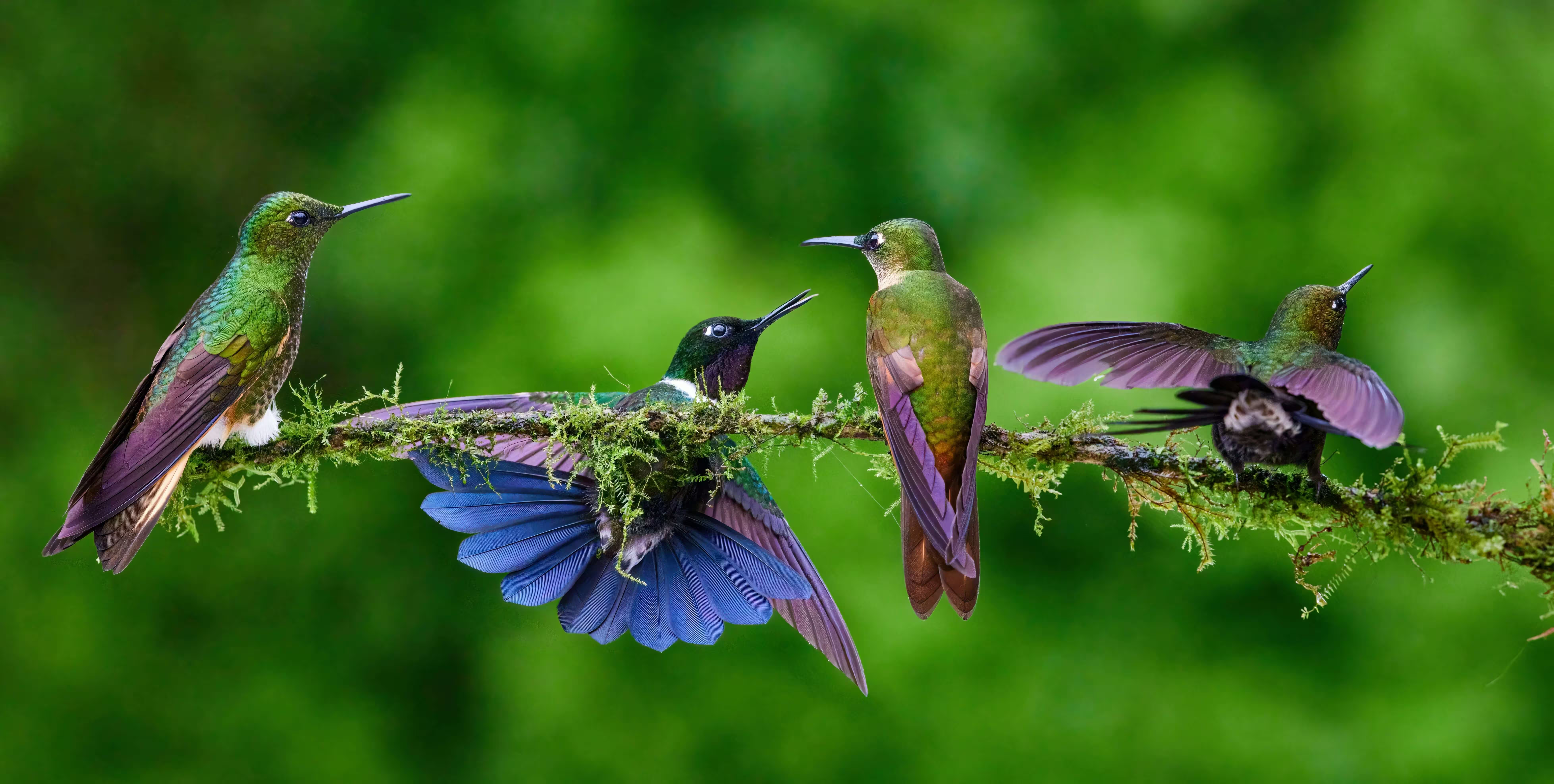
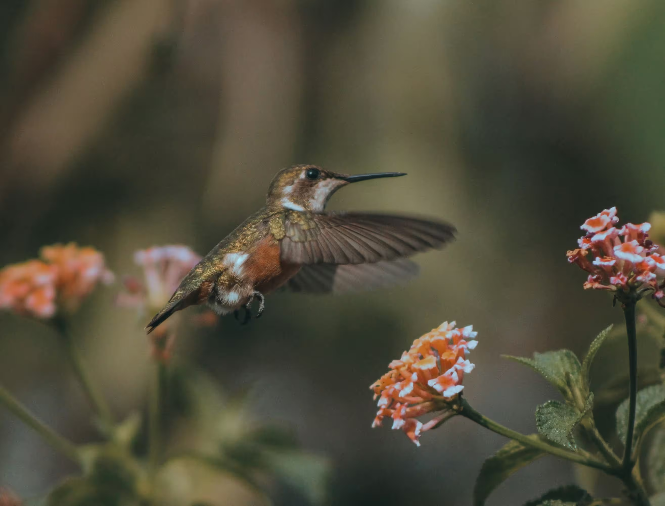
Hummingbirds
Hummingbirds belong to the avian family Trochilidae, and their closest relatives are the equally fascinating swifts.
HTML
<div class="card max-w-88">
  <img src="/images/1.avif" alt="Hummingbird" class="card-img-top" />
  <div class="card-body">
    <h6 class="card-title">Hummingbirds</h6>
    <p class='mb-0'>Hummingbirds belong to the avian family Trochilidae, and their closest relatives are the equally fascinating swifts.</p>
  </div>
  <div class="card-footer">
    <button class='btn btn-sm btn-text-primary'>SHARE</button>
    <button class='btn btn-sm btn-text-primary'>LEARN MORE</button>
  </div>
</div>
Clickable card
A card action turns the entire card into a clickable element, allowing navigation or interaction when selected. Use .card-action along with .card.
HTML
<a href="#" class="card card-action max-w-88">
  <img src="/images/1.avif" alt="Hummingbird" class="card-img-top" />
  <div class="card-body">
    <h6 class="card-title">Hummingbirds</h6>
    <p class="mb-0">Hummingbirds belong to the avian family Trochilidae, and their closest relatives are the equally fascinating swifts.</p>
  </div>
</a>
Complex interaction
Combine components and utility classes to create richer layouts with customized spacing, alignment, and behavior.
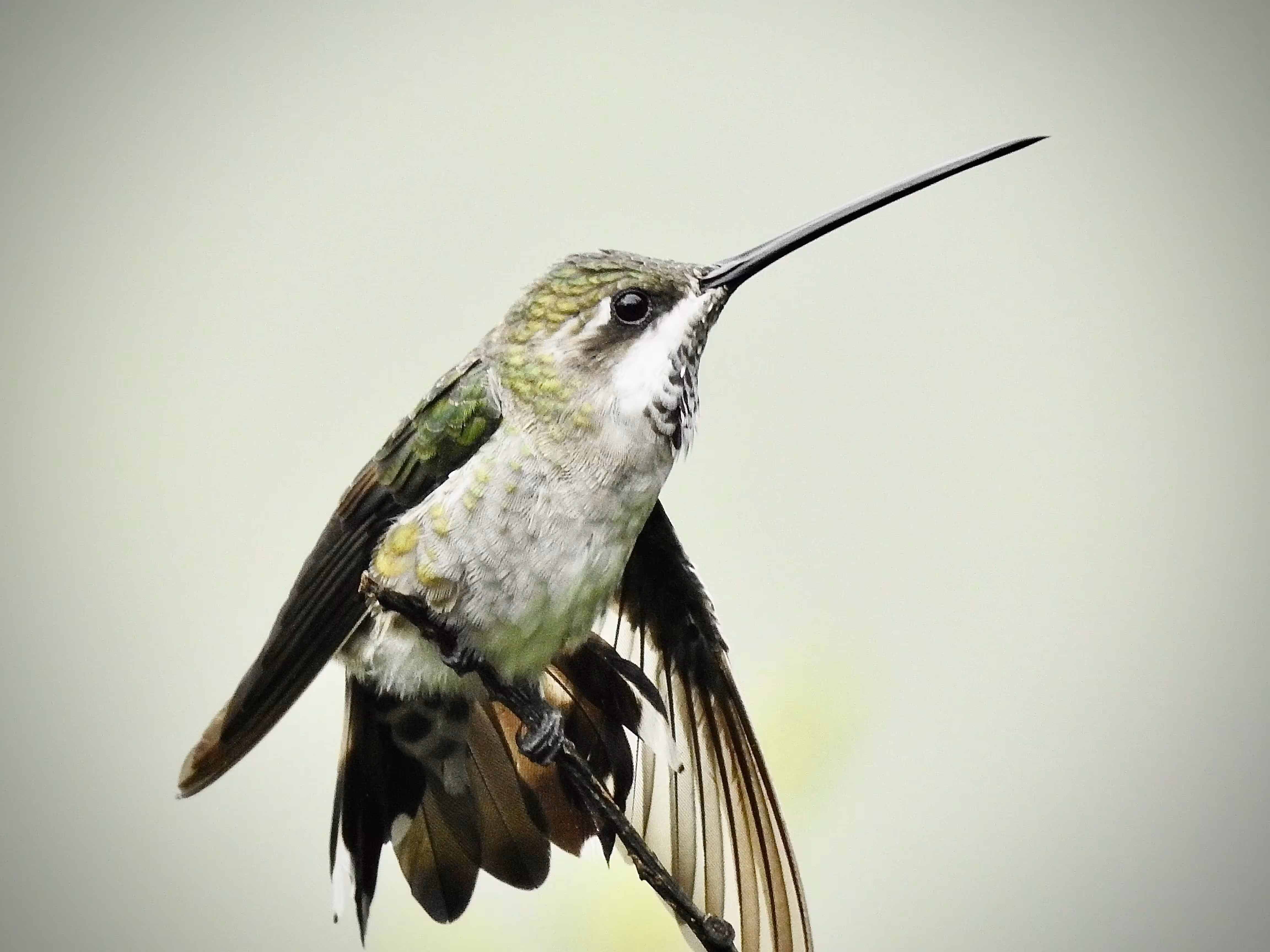
Black-throated Mango male
November 10, 2021
The male Black-throated Mango hummingbird has a metallic bronze-green upper body and flanks, a black throat and chest, and white underparts.
About
The Black-throated Mango (Anthracothorax nigricollis) is a striking species of hummingbird known for its bold coloration and confident behavior. The male is especially eye-catching, featuring a glossy black throat and chest that contrast sharply with its metallic bronze-green upperparts and clean white underparts.
Behavior & Feeding
Black-throated Mangos are known for their assertive and territorial nature. Males often defend nectar-rich flowers aggressively, chasing away other hummingbirds and even larger birds. Their diet primarily consists of nectar, but they also consume small insects and spiders, which provide essential protein.
Flight & Display
Like other hummingbirds, this species is capable of rapid wingbeats and remarkable aerial maneuvers, including hovering and backward flight. During courtship, males may perform short display flights to attract females, relying on both their iridescent plumage and agile movement to impress potential mates.
HTML
<div class="card max-w-88">
  <div class="card-header border-0">
    <div class="flex items-center">
      <div class="avatar avatar-lg me-4">
        <img src="/images/avatar/avatar_1.webp" alt="Avatar" class="rounded-full"/>
      </div>
      <div>
        <p class="text-default mb-0">Black-throated Mango male</p>
        <p class="mb-0">November 10, 2021</p>
      </div>

      <div class="btn-group ms-auto">
        <button type="button" class="btn btn-icon -mr-2" data-bs-toggle="dropdown" aria-expanded="false">
          <svg xmlns="http://www.w3.org/2000/svg" width="18" height="18" viewBox="0 0 16 16"><path fill="currentColor" d="M8 5a1 1 0 1 1 0-2a1 1 0 0 1 0 2m0 4a1 1 0 1 1 0-2a1 1 0 0 1 0 2m-1 3a1 1 0 1 0 2 0a1 1 0 0 0-2 0" stroke-width="0.5" stroke="currentColor"/></svg>
        </button>
        <ul class="dropdown-menu dropdown-menu-end">
          <li><button class="dropdown-item" type="button">View details</button></li>
          <li><button class="dropdown-item" type="button">Save to collection</button></li>
          <li><button class="dropdown-item" type="button">Report</button></li>
        </ul>
      </div>
    </div>
  </div>
  <img src="/images/2.avif" alt="Hummingbird" class='card-img' />
  <div class="card-body">
    <p class="text-sm mb-0">The male Black-throated Mango hummingbird has a metallic bronze-green upper body and flanks, a black throat and chest, and white underparts.</p>
  </div>
  <div class="card-footer flex">
    <button class='btn btn-icon'>
      <svg xmlns="http://www.w3.org/2000/svg" width="18" height="18" viewBox="0 0 24 24"><path fill="none" stroke="currentColor" stroke-dasharray="32" stroke-dashoffset="32" stroke-linecap="round" stroke-linejoin="round" stroke-width="2" d="M12 8c0 0 0 0 -0.76 -1c-0.88 -1.16 -2.18 -2 -3.74 -2c-2.49 0 -4.5 2.01 -4.5 4.5c0 0.93 0.28 1.79 0.76 2.5c0.81 1.21 8.24 9 8.24 9M12 8c0 0 0 0 0.76 -1c0.88 -1.16 2.18 -2 3.74 -2c2.49 0 4.5 2.01 4.5 4.5c0 0.93 -0.28 1.79 -0.76 2.5c-0.81 1.21 -8.24 9 -8.24 9"><animate fill="freeze" attributeName="stroke-dashoffset" dur="0.7s" values="32;0"/></path></svg>
    </button>
    <button class='btn btn-icon'>
      <svg xmlns="http://www.w3.org/2000/svg" width="18" height="18" viewBox="0 0 24 24"><path fill="currentColor" d="M17 22q-1.25 0-2.125-.875T14 19q0-.15.075-.7L7.05 14.2q-.4.375-.925.588T5 15q-1.25 0-2.125-.875T2 12t.875-2.125T5 9q.6 0 1.125.213t.925.587l7.025-4.1q-.05-.175-.062-.337T14 5q0-1.25.875-2.125T17 2t2.125.875T20 5t-.875 2.125T17 8q-.6 0-1.125-.213T14.95 7.2l-7.025 4.1q.05.175.063.338T8 12t-.012.363t-.063.337l7.025 4.1q.4-.375.925-.587T17 16q1.25 0 2.125.875T20 19t-.875 2.125T17 22m0-2q.425 0 .713-.287T18 19t-.288-.712T17 18t-.712.288T16 19t.288.713T17 20M5 13q.425 0 .713-.288T6 12t-.288-.712T5 11t-.712.288T4 12t.288.713T5 13m12-7q.425 0 .713-.288T18 5t-.288-.712T17 4t-.712.288T16 5t.288.713T17 6m0-1" stroke-width="0.5" stroke="currentColor"/></svg>
    </button>
    <button class='btn btn-icon ms-auto' type="button" data-bs-toggle="collapse" data-bs-target="#collapseExample" aria-expanded="false" aria-controls="collapseExample">
      <svg xmlns="http://www.w3.org/2000/svg" width="18" height="18" viewBox="0 0 24 24"><path fill="currentColor" d="m12 19.15l3.875-3.875q.3-.3.7-.3t.7.3t.3.713t-.3.712l-3.85 3.875q-.575.575-1.425.575t-1.425-.575L6.7 16.7q-.3-.3-.288-.712t.313-.713t.713-.3t.712.3zm0-14.3L8.15 8.7q-.3.3-.7.288t-.7-.288q-.3-.3-.312-.712t.287-.713l3.85-3.85Q11.15 2.85 12 2.85t1.425.575l3.85 3.85q.3.3.288.713t-.313.712q-.3.275-.7.288t-.7-.288z" stroke-width="0.5" stroke="currentColor"/></svg>
    </button>
  </div>
  <div class="collapse" id="collapseExample">
    <div class="card card-body border-none">
      <p class="mb-2 font-bold">About</p>

      <p class="text-sm mb-5">
        The Black-throated Mango (<em>Anthracothorax nigricollis</em>) is a striking species of hummingbird known for its bold coloration and confident behavior. The male is especially eye-catching, featuring a glossy black throat and chest that contrast sharply with its metallic bronze-green upperparts and clean white underparts.
      </p>

      <p class="mb-2 font-bold">Behavior & Feeding</p>

      <p class="text-sm mb-5">
        Black-throated Mangos are known for their assertive and territorial nature. Males often defend nectar-rich flowers aggressively, chasing away other hummingbirds and even larger birds. Their diet primarily consists of nectar, but they also consume small insects and spiders, which provide essential protein.
      </p>

      <p class="mb-2 font-bold">Flight & Display</p>

      <p class="text-sm mb-0">
        Like other hummingbirds, this species is capable of rapid wingbeats and remarkable aerial maneuvers, including hovering and backward flight. During courtship, males may perform short display flights to attract females, relying on both their iridescent plumage and agile movement to impress potential mates.
      </p>
    </div>
  </div>
</div>
Card overlay
Place content over an image using the .card-img-overlay class.
Hummingbirds
Hummingbirds are birds native to the Americas and comprise the biological family Trochilidae.
HTML
<div class="card card-img-overlay max-w-88">
  <img src="/images/5.avif" alt="Hummingbird" class="card-img-top" />
  <div class="card-body flex flex-col items-start">
    <h6 class="card-title">Hummingbirds</h6>
    <p class="mb-0">Hummingbirds are birds native to the Americas and comprise the biological family Trochilidae.</p>
    <button class="btn btn-sm btn-primary mt-auto">LEARN MORE</button>
  </div>
</div>
Card aside
Use the .card-aside layout to place images or media alongside card content, either on the left or right.
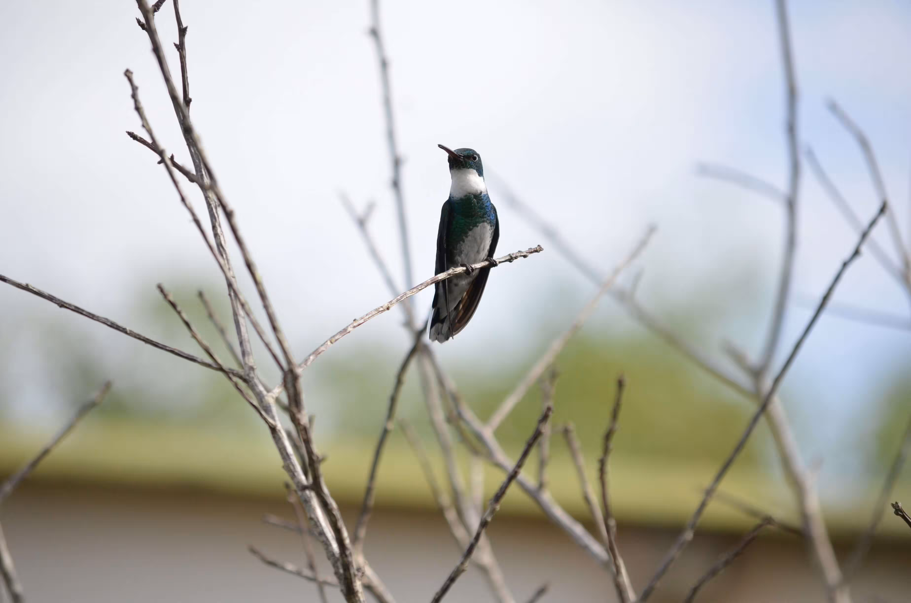
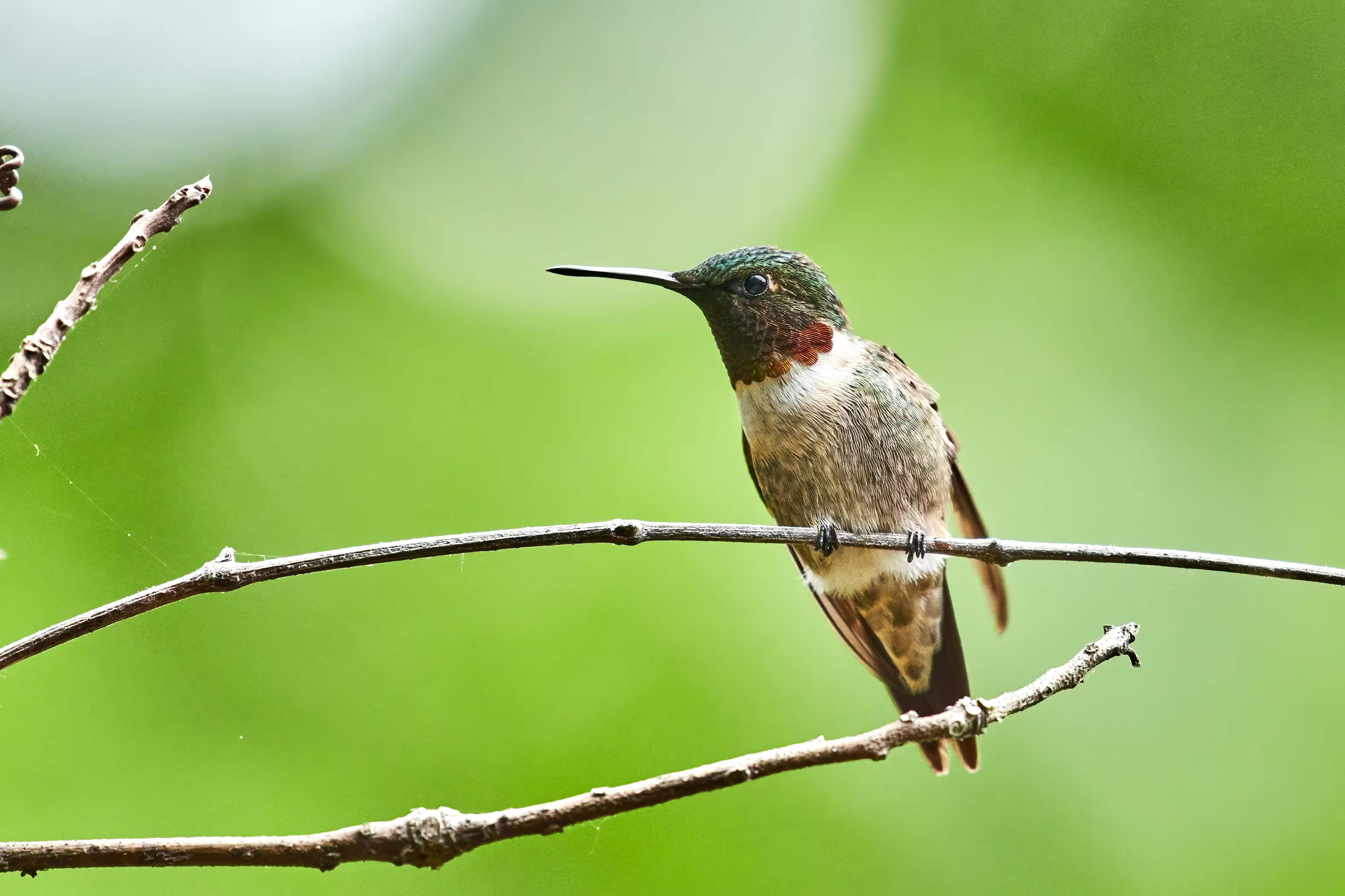
Violetear
The violetears are hummingbirds of the genus Colibri.
Violetear
The violetears are hummingbirds of the genus Colibri.
HTML
<div class="card card-aside max-w-120">
  <div class="flex items-center justify-center">
    <img src="/images/3.avif" alt="Hummingbird" class='card-img-left w-48' />
  </div>
  <div class="card-body">
    <h6 class="card-title">Violetear</h6>
    <p class="mb-0">The violetears are hummingbirds of the genus Colibri.</p>
    <button class="btn btn-sm btn-primary mt-4">Continue</button>
  </div>
</div>

<div class="card card-aside max-w-120">
  <div class="card-body">
    <h6 class="card-title">Violetear</h6>
    <p class="mb-0">The violetears are hummingbirds of the genus Colibri.</p>
    <button class="btn btn-sm btn-primary mt-4">Continue</button>
  </div>
  <div class="flex items-center justify-center">
    <img src="/images/3.avif" alt="Hummingbird" class='card-img-right w-48' />
  </div>
</div>
Card group
Use .card-group to wrap multiple cards and display them together with a consistent alignment.
Card Title
Some quick example text to build on the card title and make up the bulk of the card's content.
Card Title
Some quick example text to build on the card title and make up the bulk of the card's content.
Card Title
Some quick example text to build on the card title and make up the bulk of the card's content.
HTML
<div class="card-group">
  <div class="card">
    <img src="/images/4.avif" alt="Hummingbird" class="card-img-top h-52" />
    <div class="card-body">
      <h6 class="card-title">Card Title</h6>
      <p class='mb-0'>Some quick example text to build on the card title and make up the bulk of the card's content.</p>
    </div>
    <div class="card-footer">
      <button class='btn btn-sm btn-text-primary'>Learn more</button>
    </div>
  </div>
  <div class="card">
    <img src="/images/5.avif" alt="Hummingbird" class="card-img-top h-52" />
    <div class="card-body">
      <h6 class="card-title">Card Title</h6>
      <p class='mb-0'>Some quick example text to build on the card title and make up the bulk of the card's content.</p>
    </div>
    <div class="card-footer">
      <button class='btn btn-sm btn-text-primary'>Learn more</button>
    </div>
  </div>
  <div class="card">
    <img src="/images/6.avif" alt="Hummingbird" class="card-img-top h-52" />
    <div class="card-body">
      <h6 class="card-title">Card Title</h6>
      <p class='mb-0'>Some quick example text to build on the card title and make up the bulk of the card's content.</p>
    </div>
    <div class="card-footer">
      <button class='btn btn-sm btn-text-primary'>Learn more</button>
    </div>
  </div>
</div>
Elevated Card
Apply Tailwind shadow-* utilities to the card container to control elevation and visual depth.
shadow-sm
Card Title
Some quick example text to build on the card title and make up the bulk of the card's content.
shadow-md
Card Title
Some quick example text to build on the card title and make up the bulk of the card's content.
shadow-lg
Card Title
Some quick example text to build on the card title and make up the bulk of the card's content.
shadow-xl
Card Title
Some quick example text to build on the card title and make up the bulk of the card's content.
HTML
<div class="card max-w-72 shadow-sm">
  <div class="card-header">
    <p class='mb-0'>shadow-sm</p>
  </div>
  <div class="card-body">
    <h6 class="card-title">Card Title</h6>
    <p class='mb-0'>Some quick example text to build on the card title and make up the bulk of the card's content.</p>
  </div>
  <div class="card-footer">
    <button class='btn btn-sm btn-text-primary'>Learn more</button>
  </div>
</div>

<div class="card max-w-72 shadow-md">
  <div class="card-header">
    <p class='mb-0'>shadow-md</p>
  </div>
  <div class="card-body">
    <h6 class="card-title">Card Title</h6>
    <p class='mb-0'>Some quick example text to build on the card title and make up the bulk of the card's content.</p>
  </div>
  <div class="card-footer">
    <button class='btn btn-sm btn-text-primary'>Learn more</button>
  </div>
</div>

<div class="card max-w-72 shadow-lg">
  <div class="card-header">
    <p class='mb-0'>shadow-lg</p>
  </div>
  <div class="card-body">
    <h6 class="card-title">Card Title</h6>
    <p class='mb-0'>Some quick example text to build on the card title and make up the bulk of the card's content.</p>
  </div>
  <div class="card-footer">
    <button class='btn btn-sm btn-text-primary'>Learn more</button>
  </div>
</div>

<div class="card max-w-72 shadow-xl">
  <div class="card-header">
    <p class='mb-0'>shadow-xl</p>
  </div>
  <div class="card-body">
    <h6 class="card-title">Card Title</h6>
    <p class='mb-0'>Some quick example text to build on the card title and make up the bulk of the card's content.</p>
  </div>
  <div class="card-footer">
    <button class='btn btn-sm btn-text-primary'>Learn more</button>
  </div>
</div>
Rounded borders
Use Tailwind rounded-* utilities to customize the card’s corner radius.
rounded-none
Card Title
Some quick example text to build on the card title and make up the bulk of the card's content.
rounded-md
Card Title
Some quick example text to build on the card title and make up the bulk of the card's content.
rounded-xl
Card Title
Some quick example text to build on the card title and make up the bulk of the card's content.
rounded-3xl
Card Title
Some quick example text to build on the card title and make up the bulk of the card's content.
HTML
<div class="card max-w-72 rounded-none">
  <div class="card-header">
    <p class='mb-0'>rounded-none</p>
  </div>
  <div class="card-body">
    <h6 class="card-title">Card Title</h6>
    <p class='mb-0'>Some quick example text to build on the card title and make up the bulk of the card's content.</p>
  </div>
  <div class="card-footer">
    <button class='btn btn-sm btn-text-primary'>Learn more</button>
  </div>
</div>

<div class="card max-w-72 rounded-md">
  <div class="card-header">
    <p class='mb-0'>rounded-md</p>
  </div>
  <div class="card-body">
    <h6 class="card-title">Card Title</h6>
    <p class='mb-0'>Some quick example text to build on the card title and make up the bulk of the card's content.</p>
  </div>
  <div class="card-footer">
    <button class='btn btn-sm btn-text-primary'>Learn more</button>
  </div>
</div>

<div class="card max-w-72 rounded-xl">
  <div class="card-header">
    <p class='mb-0'>rounded-xl</p>
  </div>
  <div class="card-body">
    <h6 class="card-title">Card Title</h6>
    <p class='mb-0'>Some quick example text to build on the card title and make up the bulk of the card's content.</p>
  </div>
  <div class="card-footer">
    <button class='btn btn-sm btn-text-primary'>Learn more</button>
  </div>
</div>

<div class="card max-w-72 rounded-3xl">
  <div class="card-header">
    <p class='mb-0'>rounded-3xl</p>
  </div>
  <div class="card-body">
    <h6 class="card-title">Card Title</h6>
    <p class='mb-0'>Some quick example text to build on the card title and make up the bulk of the card's content.</p>
  </div>
  <div class="card-footer">
    <button class='btn btn-sm btn-text-primary'>Learn more</button>
  </div>
</div>
Custom card
Customize cards easily by applying Tailwind utility classes to achieve the exact style and layout desired.
Oct 20, 2025
Boost your conversion rate
Optimize your funnel with data-driven strategies that increase engagement, build trust, and drive more meaningful conversions across every touchpoint. Deliver measurable impact through optimized user journeys, actionable insights, and conversion-focused execution.
HTML
<div class="card max-w-90 h-110 bg-[linear-gradient(rgba(0,0,0,0),rgba(0,0,0,0.9)),url('/images/7.avif')] bg-cover bg-center">
  <div class="card-body mt-auto grow-0">
    <p class="mb-2 text-gray-300">Oct 20, 2025</p>
    <h5 class="text-white">Boost your conversion rate</h5>
    <p class="text-gray-300 line-clamp-3">
      Optimize your funnel with data-driven strategies that increase engagement, build trust, and drive more meaningful conversions across every touchpoint. Deliver measurable impact through optimized user journeys, actionable insights, and conversion-focused execution.
    </p>
    <button class="btn btn-sm btn-primary">LEARN MORE</button>
  </div>
</div>
Class Overview
A list of all available utility classes for the card component.
| Class Name | Type | Description |
|---|---|---|
| card | Component | Card |
| card-header | Inner | Card header component |
| card-body | Inner | Card body component |
| card-footer | Inner | Card footer component |
| card-title | Inner | Card title |
| card-subtitle | Inner | Card subtitle |
| card-action | Modifier | Clickable card |
| card-img-overlay | Modifier | Card overlay |
| card-aside | Modifier | Card Aside |
CSS variables
The card component is built using a set of CSS variables. These variables provide flexibility for customizing styles. Read more about customizing with CSS variables here.
.card {
  --card-bg: var(--background-color-subtle);
  --card-color: var(--text-color-muted);
  --card-font-size: var(--text-sm);
  --card-border-width: var(--border-width);
  --card-border-color: var(--border-color-default);
  --card-border-radius: var(--radius-lg);
  --card-padding-x: --spacing(4);
  --card-padding-y: --spacing(4);
  --card-cap-padding-x: --spacing(2);
  --card-cap-padding-y: --spacing(2);
  --card-cap-bg: transparent;
  --card-cap-color: null;
  --card-title-color: var(--text-color-default);
  --card-title-space-y: --spacing(2);
  --card-title-font-weight: var(--font-weight-bold);
  --card-subtitle-font-weight: var(--font-weight-medium);
  --card-overlay-brightness: 0.6;
}