The tailwind framework
Hummingbird gives you pre-built components
with full Tailwind customization — no compromises.

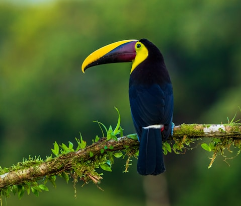


Every detail, considered.
We built the UI system we always wanted - one that prioritizes clean code, a minimal footprint, and a developer experience that's a joy, not a chore.
Semantic & Clean Markup
Readable, purpose-driven class names for maintainable, clutter-free HTML.
Easy Theming
Customize colors and styles with minimal CSS variable changes.
Fully Customizable
Tweak any component using Tailwind utilities or global design tokens.
Built for Optimization
No unused CSS. Small file sizes. Production-ready out of the box.
Framework Compatible
Enjoy seamless compatibility with all modern frameworks and zero rush.
Structured for Scale
All components follow a consistent design system for better maintainability.
An evolved approach
Hummingbird's utility-first approach delivers smaller bundles, better performance, and advanced customization by eliminating unused CSS.

 Hummingbird Hummingbird |  Tailwind CSS Tailwind CSS |  Bootstrap Bootstrap | |
|---|---|---|---|
| Ready-to-use components | |||
| Clean, semantic HTML | |||
| Pre-built dark mode | |||
| Utility-first approach | |||
| Advanced customization | |||
| Accessibility-first design | |||
| Zero unused CSS |
Clean markup, full control.
Ditch long utility class strings. Hummingbird gives you complete freedom of pixel-perfect tweaks - plus full Tailwind flexibility.
Welcome Back
Enter your login details
Dark mode, perfected.
Hummingbird's dark mode offers automatic detection or manual toggle, ensuring optimal contrast and a sleek appearance.

Plug & play components,
for every modern framework
Hummingbird, the framework-agnostic tool provides typed wrappers for popular tools, ensuring smooth integration & easy DIYs.
View integration guides


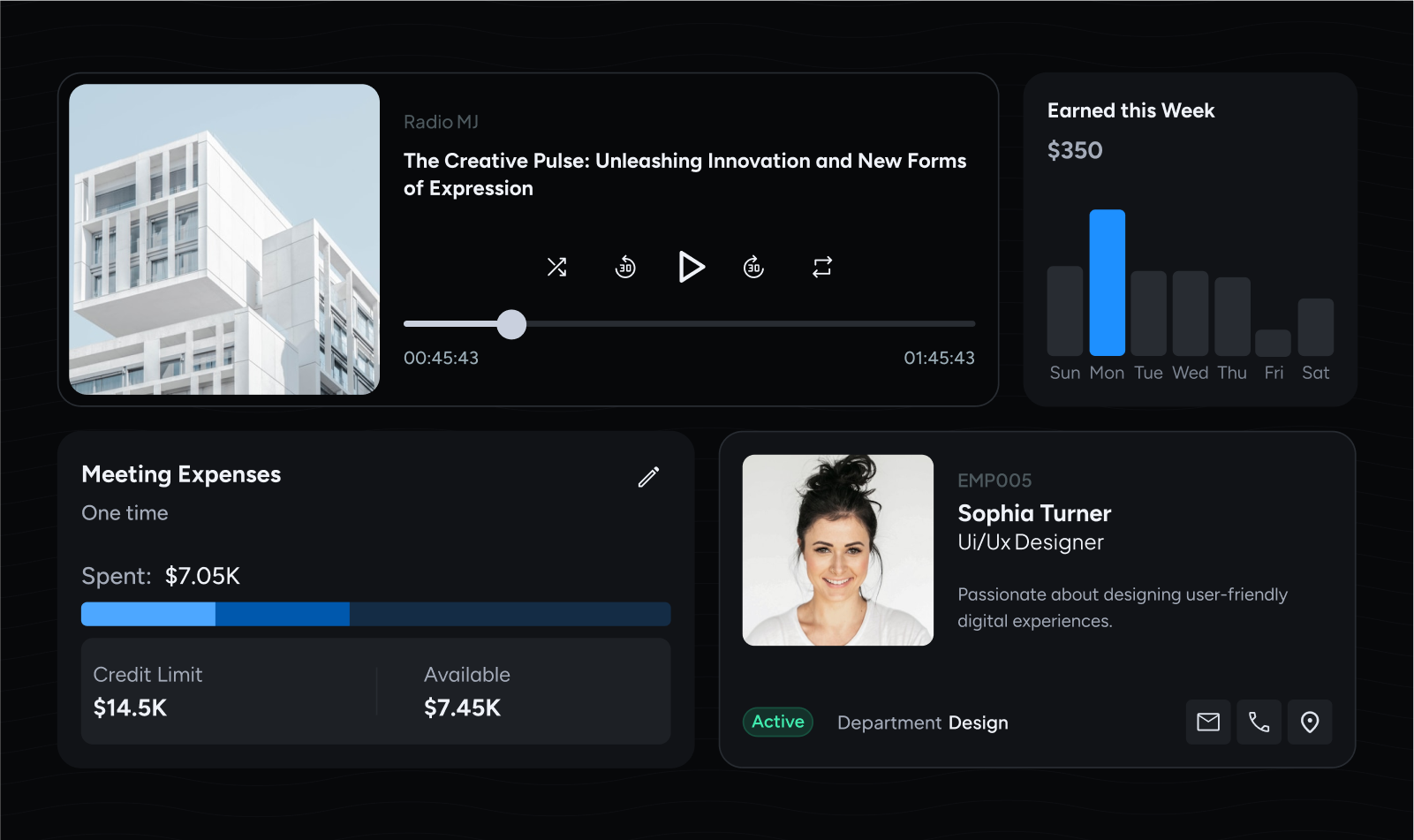
Production-ready UIs,
out of the box
Hummingbird provides production-ready components. Filter by category or use-case to find what you need.
Browse components


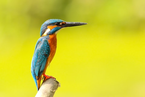


Global CSS Core
A smart core built on CSS variables, giving you a logical and flexible foundation for effortless customization.
Global Styles,
Granular Control
Hummingbird employs a two-tier CSS framework that offers both global oversight and localized adaptability.
Learn more about customizationCentralized Customization
Change a root variable and watch your entire UI update instantly. Total consistency, zero repetitive work.
Component-Level Overrides
Override styles on any component with a single, clean declaration. No more fighting with specificity.
Modern JavaScript,
built to perform
We revamped Bootstrap's JavaScript for the modern web with TypeScript support and zero dependencies.
Learn more about JavaScript


